Combine Guidance's technical depth and world class CX for intuitive digital experiences.
Proven conversion rate optimization (CRO) strategies and award winning creative to elevate your brand storytelling.
Optimize the path to purchase and boost conversion for long term success.
Transform channel cannibalization into new market penetration and profitability.
User-friendly interface, drag-and-drop capabilities, and in-line editing to create experiences that integrate seamlessly on mobile, social, or in-store
Fully integrated and specifically designed for modern ecommerce, content, merchandising and marketing
Sell more at every stage of growth, from small startups, to mid-market businesses, to large enterprises with the leading Open SaaS solution
Launch quickly with the omnichannel enterprise platform where you can start, grow, and scale your business—backed by an ethical pricing model.
Guidance upgraded, migrated, and replatformed 13 websites for T3 Micro while simultaneously redesigning a full brand experience.
This case study will be especially relevant for those interested in the following topics:
T3 produces advanced, long-lasting hair styling tools. Those are good attributes from the consumer perspective but present challenges for the business. T3 selected Guidance for a multisite platform upgrade that would also reflect their brand promise, create complementary purchase opportunities, and encourage ongoing engagement.
Part beauty venture, part tech start-up, T3 launched in 2003 with a mission to reimagine the hair styling experience for women, by creating an advanced set of hair styling tools. They describe their products as "technology forward, fast working, designed with high performance and better results in mind." The products are also reflective of their ideal customers: smart, confident, dynamic, and sophisticated. The design of their products, as well as the redesign of their sites, needed to mirror that profile.
In today's consumer world, most products you encounter are designed and manufactured to be disposable. The beauty industry is no different, but in every industry, there are companies working to make durable items with advanced technology, designed and manufactured to last for years to come.
When it comes to hair styling tools, T3 is one of those remarkable companies looking to serve their audience with products they can trust long-term, and their customers are willing to pay a premium price for their next-generation hair care technology. T3 strives to help women get reliably beautiful results while also protecting the health and radiance of women's hair, which, in their words, is "the ultimate accessory."
One of the most obvious challenges for a business that makes a long-lasting product is repeat business. It's a factor for T3 as well, and though it wasn't the primary driver of the project that ultimately brought Guidance and T3 together, it was one of the reasons why Guidance was ultimately the perfect partner for T3.
T3 was ready for a change in their ecommerce and thinking bigger about how they would implement it. Most of their websites were on Magento, but one was on Shopify. Furthermore, not all of their Magento sites were on the same version of Magento. Their localized sites in the European Union were on Magento 2, whereas their U.S. site was on Magento 1. And if they were going to go to the effort of revamping the back end of their ecommerce, why not revamp the front end as well?
A makeover with that kind of scope, that needed to come together all at once and make for a fabulous world relaunch, would require a creative partner with a similar passion for melding design and technology. After a competitive RFP process, T3 selected Guidance on the strength of its experience with Magento ecosystem, success with complex replatforming and migration projects, and approach as a holistic ecommerce agency.
T3, like any business, wanted to increase its annual revenue. Two of the ways they wanted to do that, in specific, were to increase the conversion rates on their sites, and to increase customer engagement with the brand. The former, increasing conversion rates, is easier to wrap one's head around. The right combination of design, development, and experimentation can get you there. The latter, increasing customer engagement, is a bit more complicated. Giving people a reason to come back to your site, especially when your products are built to last for years, requires longer-term strategy and the resources to fulfill the tactics.
When better conversion and increased engagement come together, you create the opportunity for repeat business. Even with durable products, repeat business is still possible. It just looks a bit different. T3 has that potential, because they sell a variety of hair styling tools. This would be one of the ways Guidance helped T3 pursue the goal of increased annual revenue growth for T3, by creating more seamless ways for customers to consider complementary tool and accessory purchases.
To come up with a design that would appeal to the ideal customer, Guidance worked with T3 to more deeply understand that customer, the "T3 Woman." Guidance conducted interviews with T3 customers, and examined their shopping patterns through heat maps and other site analytics. Guidance also conducted interviews with stakeholders at T3 to understand their own customer perceptions, key brand pillars, and what they wanted to achieve with the brand experience.
Together, they arrived at a portrait of the T3 Woman as dynamic, intelligent, and accomplished. She's confident without being too serious; she appreciates quality and understands the value of investing in it. This led Guidance to consider a design approach with a sense of being elevated, yet relatable. The brand would convey luxury and sophistication, and welcome its audience with an approachable, delightful presentation.
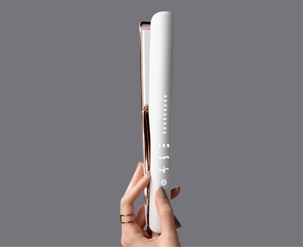
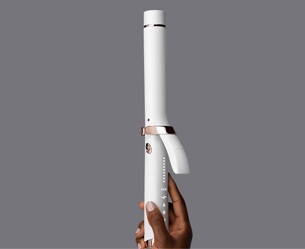
Customer and stakeholder interviews revealed agreement not just on the quality of T3's products, but the look of the products as well. T3 considers their product design to be a key brand pillar and sets out to create hair styling tools that are as beautiful to behold as the results they create. Their customers agree, with feedback repeatedly complimenting the look of the products, and especially with T3's color choices.
“To the Guidance team… EXTREMELY WELL DONE”
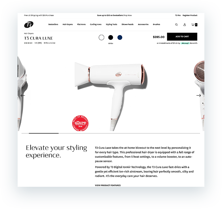
Informed with the fruits of thorough qualitative and quantitative research, Guidance developed a mobile-first design focused on the beauty of the hairstyling tools themselves. The layouts emphasize product imagery, in a fresh and uncluttered fashion.
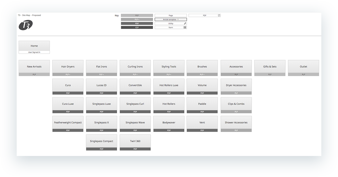
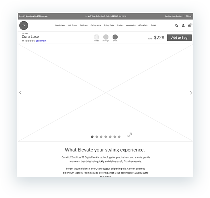
T3's product catalog is very refined. They're focused on a select range of hair styling tools, and they only offer a few items in each category. Guidance takes advantage of that specialization in its design, creating an experience that starts with a UI/UX scheme where the product categories serve as the top-level site navigation. From there, the category landing pages break out of the basic grid pattern that a traditional ecommerce product listing page (PLP) tends to offer. And the product detail pages (PDPs) are rich with content and imagery.
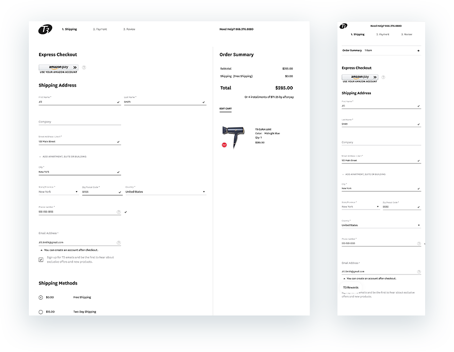
With a spacious design in place to highlight the best attributes of T3's products, Guidance turned its attention to one of its own particular strengths, the checkout process. With so many years of experience in the Magento ecosystem, Guidance's developers are well versed in taking the out-of-the-box feature set offered by Magento and customizing it to create a checkout process that not only improves conversion rates, but also ensures that the transactional experience feels like it's a natural extension of the brand experience itself.
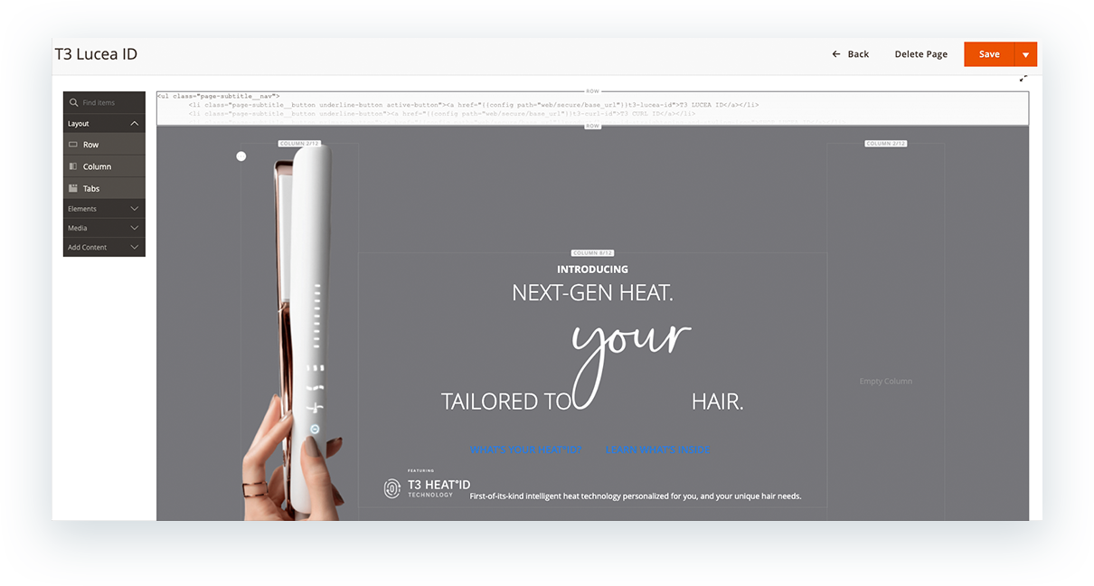
From the technical side of the project, T3's goal was to bring all of their storefronts under one figurative roof. In particular, they were very excited about the potential of Magento's Page Builder extension and wanted to take advantage of it for the management of their site content. To do that, they needed to get all 13 of their sites on the Magento 2 platform and merged into using one code base.
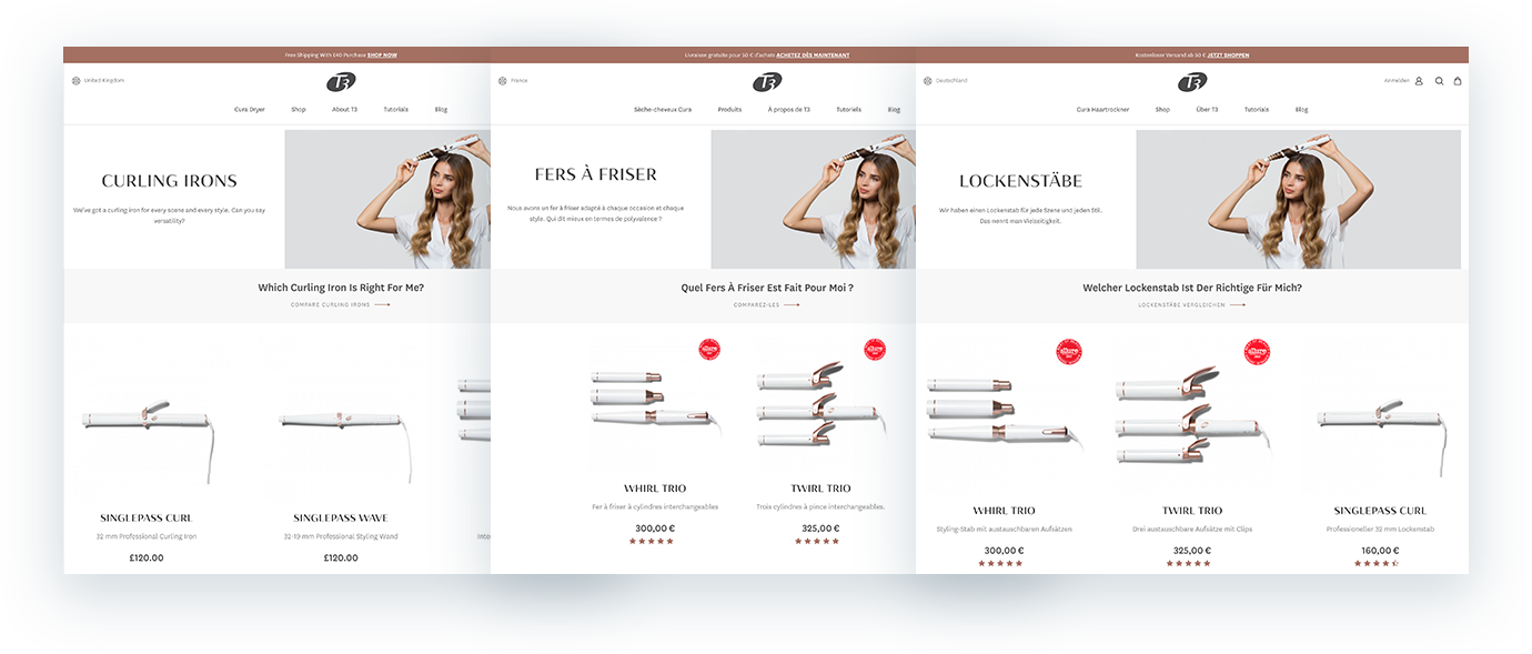
But at the time T3 engaged Guidance for this project, only one of the T3 sites was on Magento 2, their EU store. It was on an earlier version, though, so that would require a bit of an upgrade. Their UK site presented an entirely different challenge. They were on Shopify, and so that site had to be completely migrated onto Magento 2.
Meanwhile, the U.S. site for T3 was a very mature Magento 1 ecommerce site. They had, in Guidance's reckoning, nearly every integration an ecommerce site could have to maximize its performance, and T3 wanted to keep it that way. So not only would the U.S. site need to go through a major upgrade, it would also need those integrations to make the necessary leaps as well.
The variety of platforms was one challenge. Time would prove to be another. Magento 1 was nearing its end of life, so it was imperative that the T3 U.S. site make the transition to Magento 2 as soon as possible. Even though it often takes years to build out a feature set like the U.S. site had, the need for speed in the relaunch was imperative. The need to manage all the moving parts without breaking anything was also imperative. And part of the plan also entailed moving the AWS production stack from Europe to North America.
Ultimately, Guidance developed a phased approach with rolling deployments. The EU stores were operating at the most recent version of Magento as compared to T3's other sites, but not at the most updated version available. So the initial steps involved bringing the rest of T3's sites to the same state as the EU sites. Then, after testing on a stage server to ensure the sites wouldn't all break on rollout, Guidance performed what was internally referred to as "The Great Code Merge," which brought all 13 sites into one code base and up to the most recent minor/patch version of Magento available.
Upgrading to the most advanced version of Magento also unlocked the full potential of their Page Builder extension for T3. Guidance extended the default functionality of their Page Builder install to support T3’s new CMS content needs. Everything is customizable via their admin tool, from the item-level content all the way up to their category output and product data attributes.
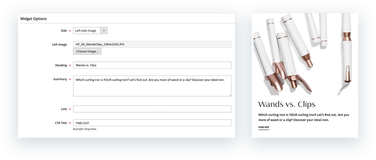
Beyond the extensions, Guidance also developed personalized widgets from scratch for T3, allowing them to easily experiment with the design and layout of their product listing pages (PLPs) and product detail pages (PDPs) without compromising the frontend experience. T3 can keep their site fresh with options for different sets of carousels for imagery and text features, with customized product lists and setups. For the PDPs in particular, Guidance developed attribute sections that can be enabled and disabled as needed, to add variety to the presentation of each product.
From a design perspective, Guidance had established a strong focus on visualization of the product imagery. From the technical perspective, implementing that kind of design requires an approach that takes scrolling behavior into account, creating smooth transitions from section to section that appeal to the eye of the consumer. Guidance took great care with the structure and layout of the template rendering, using fade-in sections to keep user attention while distracting from the image-heavy resource load happening on the backend.
“Extremely well done. Congratulations!”
Guidance brought 13 global ecommerce sites into one code base on Magento 2 for T3, while redesigning their sites to confidently showcase their premium products and appeal to their sophisticated audience.
The project supported T3's business goals to increase conversions, revenue growth, and customer engagement, while making the sites easy to manage.
Silver Winner - General - Beauty + Cosmetics
Silver Winner - Best User Interface
Platinum Winner in Interactive Brand Experience
T3 engaged Guidance for an ecommerce project that required a unique combination of upgrades, migrations, and replatforming. Speed to launch was a must, as was a holistic approach to creating a new brand narrative around their products.
After gathering data through interviews and analytics, Guidance developed a modern, fresh, and uncluttered design, creating an elevated yet relatable brand experience. A series of rolling deployments brought all 13 global sites up to the most recent Magento 2 instance, making all the benefits of Page Builder available to T3 as well.
Consolidating all of T3's sites on the a more modern ecommerce platform, with unified functionality, gives them complete control of their content output behind the scenes, without compromising the look they present to the world.
See the work
https://www.t3micro.com/
To receive information on proven B2C and B2B strategies, please subscribe to our email newsletter.
© 2024 Guidance. All Rights Reserved.