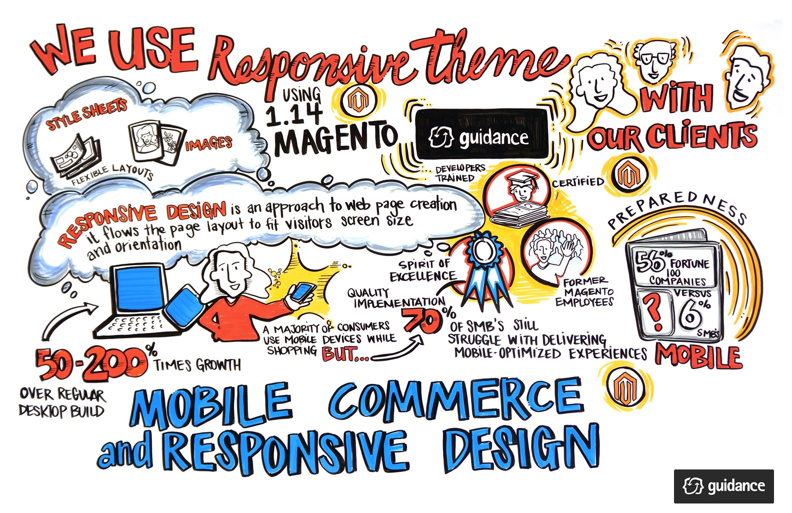
By now, most retailers know that responsive design is not a “nice to have.” Customers expect a smooth, intuitive shopping experience on every connected device. But according to our partner Magento, 70% of small to medium businesses are still scrambling to catch up.
Often, the constraints come down to money and time. Launching and maintaining both a website and a mobile site can be challenging for smaller companies.
That’s where Magento Enterprise Edition 1.14 can help. The latest version has a responsive theme baked right in. Retailers can launch a tablet and smart phone-friendly site that’s scalable, flexible and great for SEO.
Here at Guidance, we’re known for our Magento Enterprise Edition implementation expertise. We also tailor our services to fit each client’s specific needs. One great example is the forthcoming Johnny Was site, which launches later this month.
"When the company first approached us, they weren’t sure which elements of the site to redesign or how to approach the project," explains Annalisa Agoston, Creative Director at Guidance. "Our project manager, our information architect and I conducted exploratory interviews with real shoppers across multiple touchpoints. We discovered that most of their online business came from tablets, so clearly the site had to be responsive."
According to Agoston, the team at Johnny Was was eager to collaborate on a full redesign. "They knew we could help them solve for a better customer experience," she says. "They got really excited when they saw the responsive work we did for Silver Jeans and the way it leveraged social media." 
The illustration you see here offers a peek at how we approach responsive design using Magento Enterprise Edition 1.14. There are several websites launching on this platform, which we'll announce on our blog in the coming weeks. If you need a site that’s shoppable on almost any mobile device, this new version might be right choice for your business. Contact us to learn more!


