Future of Ecommerce Web Dev: How Mobile-First Web Design Is Shaping Ecommerce
Mobile-first is essential for functioning in a world that increasingly centers around mobile technology. The fact is that mobile usage is huge, and it’s still on the rise. The number of global mobile users is projected to reach nearly 7.5 billion people by 2025. That’s almost everyone.
Mobile is also increasingly becoming ground zero for online shopping experiences. Currently, 60% of shopping behavior starts on mobile, and mobile impacts $1 trillion of in-store sales.
There’s no question that a mobile ecommerce website that offers a stellar experience will be a mainstay in the future, which is why every business should know what a mobile-first approach is and how it can lift their bottom line.
What Is a Mobile-First Approach in Ecommerce?
Mobile-first design and web development enable your ecommerce website to look and function flawlessly on any device.
Instead of starting with the desktop customer experience (CX) and then adapting the design to respond to different-sized screens, with a mobile-first approach, developers and designers consider mobile users first.
As a result, your ecommerce website or application will offer a seamless experience for all your users every time they visit your site, whether it’s through a laptop, desktop, smartphone, or tablet.
Mobile-First Web Design vs. Responsive Design: What’s the Difference?
Both mobile-first and responsive websites will look good on a mobile device. However, the mobile-first site will likely have better functionality and a superior UX. That’s because mobile-first web design prioritizes the mobile CX.
On the other hand, responsive web design best practices ensure a website will display properly on any device. It is designed to respond to changes in device screen size. However, it might lack features that support mobile users.
Features That Set Mobile-First Web Development Apart
A mobile-first strategy will focus more on website elements that allow for a simple, fast, and intuitive experience for users.
Here are some of the features that you’ll almost always see with a mobile-first website:
- Simplified design: The design is clear so users can focus on important information and navigational elements.
- Fast page loading: Without streamlined elements and smaller file sizes, mobile pages load faster.
- Easier navigation: Mobile-first sites have higher clickability thanks to clear, bold, easy-to-read menus, hyperlinks, and buttons.
- Swipe-friendly: Users can navigate between pages with a thumb swipe.
- Larger fonts: Because people are reading on a smaller screen, fonts are generally larger and easier to see.
- Easier to scan: Designers use white space and large, bold headings with descriptive text to separate chunks of content for easy scanning.
- Accordion menus: A single menu icon that opens with a tap lets users preview the site and navigate to the correct page without having to search for hyperlinks.
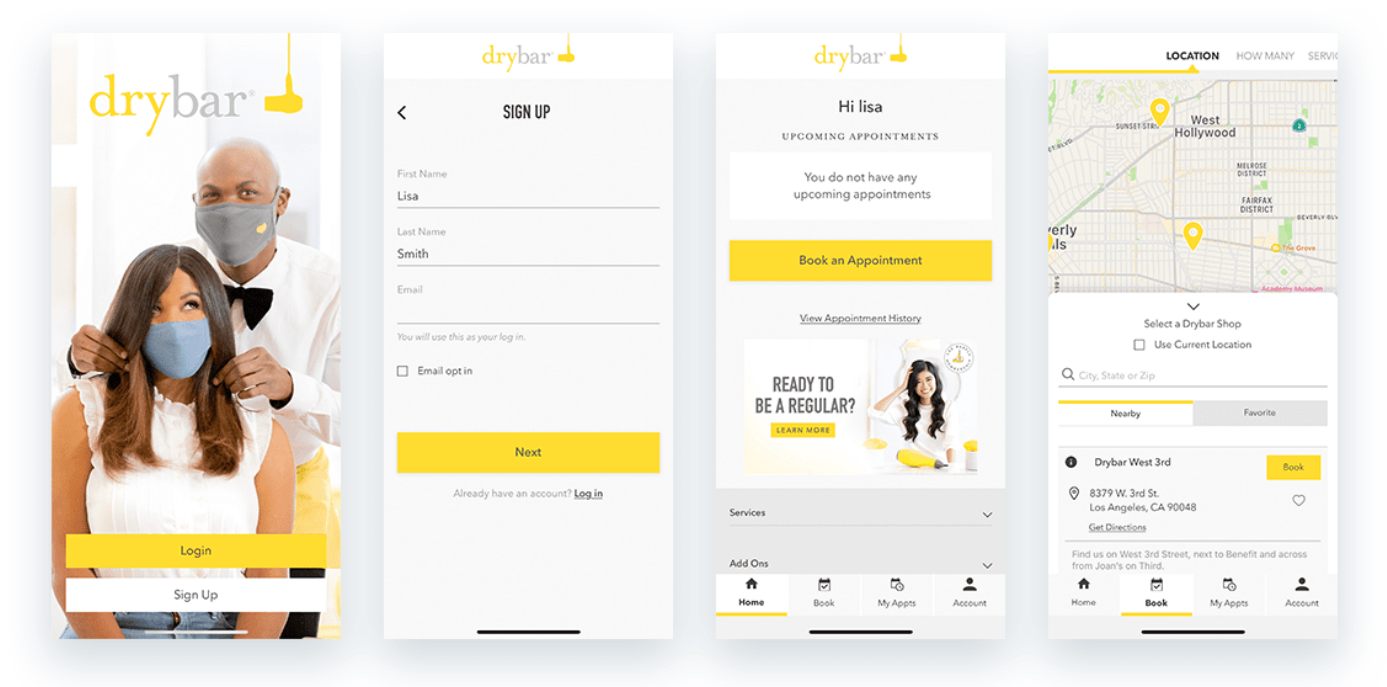
Take a look at how our mobile-first app for our client, Drybar looks. The design is clean. The buttons are front and center. And every page is focused on a specific action so movement through the appointment-booking funnel is smooth and hassle-free for customers.

Do Desktop Users Have a Good Experience on Mobile Ecommerce Sites?
Because mobile-first forces designers to accommodate the UX experience to small screens, even users on larger screens will have a better experience.
Mobile-first websites are more enjoyable to navigate, which is essential in ecommerce. They are purpose-built to make it easy for people to find what they’re looking for quickly, letting customers browse, select, and buy in a few swipes and taps.
Why a Mobile Ecommerce Website Is Important
Mobile has been a priority in ecommerce web development for years. As Brian Beck, Guidance’s former SVP of Ecommerce and Omni-Channel Strategy has pointed out, for most of our clients, over half of their traffic comes from mobile devices. For some brands, it’s closer to 70%.
But it’s not just the ecommerce companies we work with. The mobile shopping trend is global. In 2023, mobile ecommerce sales will make up 60% of all ecommerce purchases, reaching a total of $2.2 trillion.
That fact is that people spend more time on their phones and tablets, and taking care of some of their shopping while on their devices is convenient.
Mobile-first web development makes your ecommerce shopping experience more appealing for customers, no matter what device they have on hand. That means they can shop while lying on the couch or waiting in line for coffee just as easily as they can if they’re sitting in front of their computer.
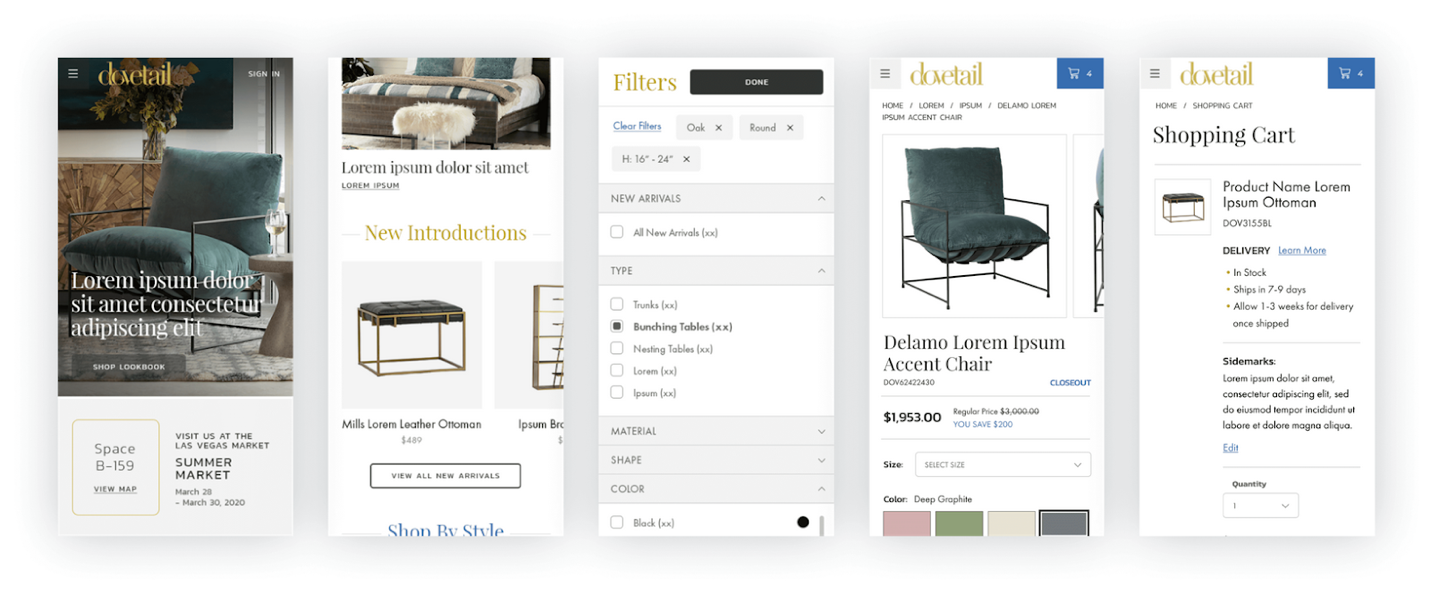
And the more that people grow accustomed to this convenience, the more they’ll gravitate toward merchants that make mobile ecommerce friction-free, like this mobile shopping experience we created for our client, Dovetail on Optimizely.

Even for big-ticket items like furniture, customers can browse through their options, view high-quality product photos, and customize their style and shipping preferences with ease despite the small device screen.
Without this level of sophistication on smaller screens, ecommerce sellers miss out on the sales potential of mobile shoppers. But if an ecommerce website makes shopping a breeze, brands can expect to profit from our increasingly mobile-first world.
Creating Your Mobile-First Strategy: Best Practices for Ecommerce Businesses
Mobile-first design can involve a deep shift in how your website functions and the user interface (UI) design. You should be strategic when deciding on your mobile-first website strategy.
As you start the ideation process, keep the following considerations in mind:
Testing Will Ensure Your Site Appeals to Your Users
Before making big changes, understand what UI and CX design elements will benefit customers.
Use A/B testing to find out what elements customers might prefer and answer questions such as:
- What type of navigation bar reduces friction for mobile customers?
- What button style leads to the highest conversion rate?
- What elements seem to frustrate mobile users?
Visual Hierarchy Can Help Increase Conversions
A mobile ecommerce website has a primary goal: to sell your products. So mobile-first design should be set up in a way that facilitates more conversions.
Establishing a visual hierarchy can help with this. Visual hierarchy involves laying out navigation icons and other visual elements in a way that helps users flow along a website’s buyer journey with ease.
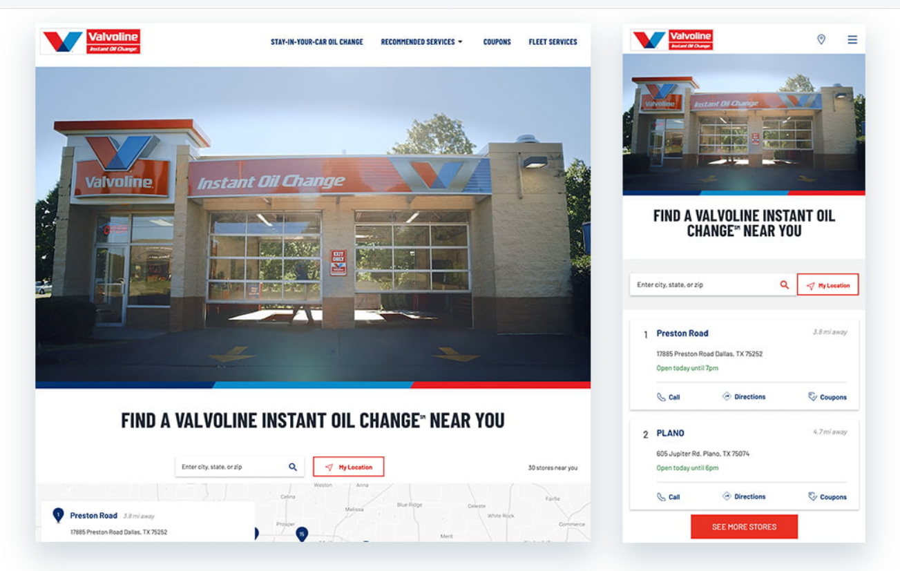
When the expert team at Guidance created an Optimizely-powered mobile-first design for Valvoline, we focused on actional elements when creating the visual hierarchy.

The call to action is front and center. Large buttons and clear search options enabled us to achieve a high level of functionality within a small space — without sacrificing aesthetics.
Designing for Micro-Moments Can Make a World of Difference
Mobile devices are prime territory for micro-moments. Google defines these moments as times when “people reflexively turn to a device — increasingly a smartphone — to act on a need to learn something, do something, discover something, watch something, or buy something.”
In other words, these are moments of focused intent. Customers are ready for something, so make sure your mobile ecommerce site is ready to help them along their journey if they meet you in a micro-moment.
Even if a customer doesn’t buy in that micro-moment, they might fill their cart for later, sign up for a newsletter, or discover a product they love and bookmark the site.
How can you use mobile-first design to make the most of micro-moments?
Consider your website visitors who are ready to act. Make what they are looking for easily accessible the moment they land on the site.
For example:
- Is there a button leading to the main product page that’s visible without scrolling?
- Is there a visible promotion that can serve as the nudge a customer needs to make a purchase?
- Can intentional customers quickly access the information they need to further their journey, such as a contact email, a well-organized product menu, or a search feature?
The more mobile-first design can facilitate a flow from the “aha” moment a customer has to the action they want to take, the more effective a mobile ecommerce site will be.
Develop a Winning Mobile-First Strategy with Help from Guidance
Mobile-first web development and design can give ecommerce sites a leading edge. It can also help to prepare for the future of ecommerce as mobile usage is only going to go up.
Contact us today and find out how our experienced team of CX and web development experts can help implement a powerful mobile-first strategy.
