A/B testing is one of the most powerful ways to enhance your brand’s digital experience. After all, it’s a proven way of improving customer loyalty, increasing engagement, and boosting sales across all your web channels. But what elements and features should you be measuring?
 At Guidance, we start by looking at 6 components of your web experience that you should be examining.
The Home Page
Undoubtedly, this is the most visible and visited page on your site. Therefore, you should consider it to be:
- Your #1 advertising platform.
- The place where you create the all-important first impression.
- And a key destination that conveys your brand identity.
Testing different layouts is one of the most impactful things you can do. What colors, designs, typefaces, messages, and calls to action resonate the most with users? You won’t know what works best unless you A/B test these various features.
Here, it’s critical to remember that user attention spans are shorter than ever. In 2000, it took humans about 12 seconds to lose interest. Today, that figure is down to 8 seconds. Even goldfish can focus longer than people.
Consequently, graphics, layouts, and text that help customers forge an emotional connection with your brand quickly are imperative. The best way to do that is to develop a rigorous culture of testing so that you can gauge what digital users respond to.
Navigation
This is the section where people learn about who you are, what your business is about, and what products and services you offer. The elements here should be clear, well laid out, and easy to maneuver.
Of course, remember the Rule of 7 (+/- 2). Put simply, too many components in your dashboard experience will overwhelm users. When you experiment with different configurations you are essentially letting your customers vote on what items and arrangements work best.
Category Page
 If customers are interested in your products and services, then this is where they begin to show intent to purchase. Here you’ll want to A/B test category interrupters, accompanying visuals, and promotional banners. You’ll also want to measure layout design, color schemes, and the number of categories featured. This is one of the most popular destinations on your site. As a result, determining what clicks with customers is particularly important.
 Product Page
This is where customer’s display intent. Therefore, you have to determine what information will prompt them to make a purchase. Here, there are a number of different elements you can test:
- Placement of pricing information.
- The inclusion of returns policy.
- Different formats for product descriptions and specs.
Shipping Page
Your shipping policy can be decisive when it comes to conversions. Try testing alternative rates, and different thresholds for free shipping. What options cause customers to add items to their carts?
Of course, you have to manage offers against the profitability of shipping. Indeed, you don’t always need to give free shipping, but you do need to determine which policies your customers respond to.
Checkout and Shopping Cart
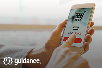
There is no greater intent than when somebody puts an item in their cart. But this stage can be make or break for customers. You don’t want any last-minute glitches to spoil their experience or cause them to bail out. Specifically:
- Does a coupon box increase conversion?
- Is it helpful for the customer to see security information?
- Do auto-fill features improve the checkout process.
Takeaway
In the past, people made decisions about e-commerce sites based on their gut instincts. That approach worked, to some extent, because the field was so novel. However, experience shows that developing a culture of testing is a huge competitive advantage. Simple A/B testing is one of the most effective ways to ensure that your brand can keep pace with fast-paced and increasingly choosy customers.
If you need any assistance or would like more information, please contact Guidance.


